Colour is one of the quickest ways to change the mood of a space. The right painting doesn’t just add colour; it shifts the atmosphere of the whole room. Here’s how different palettes can work with your home.
Warm, glowing palettes
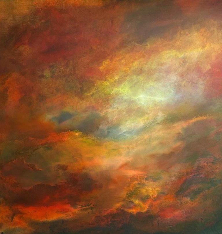
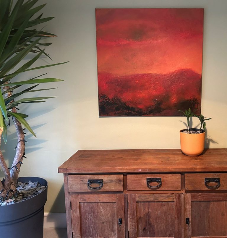
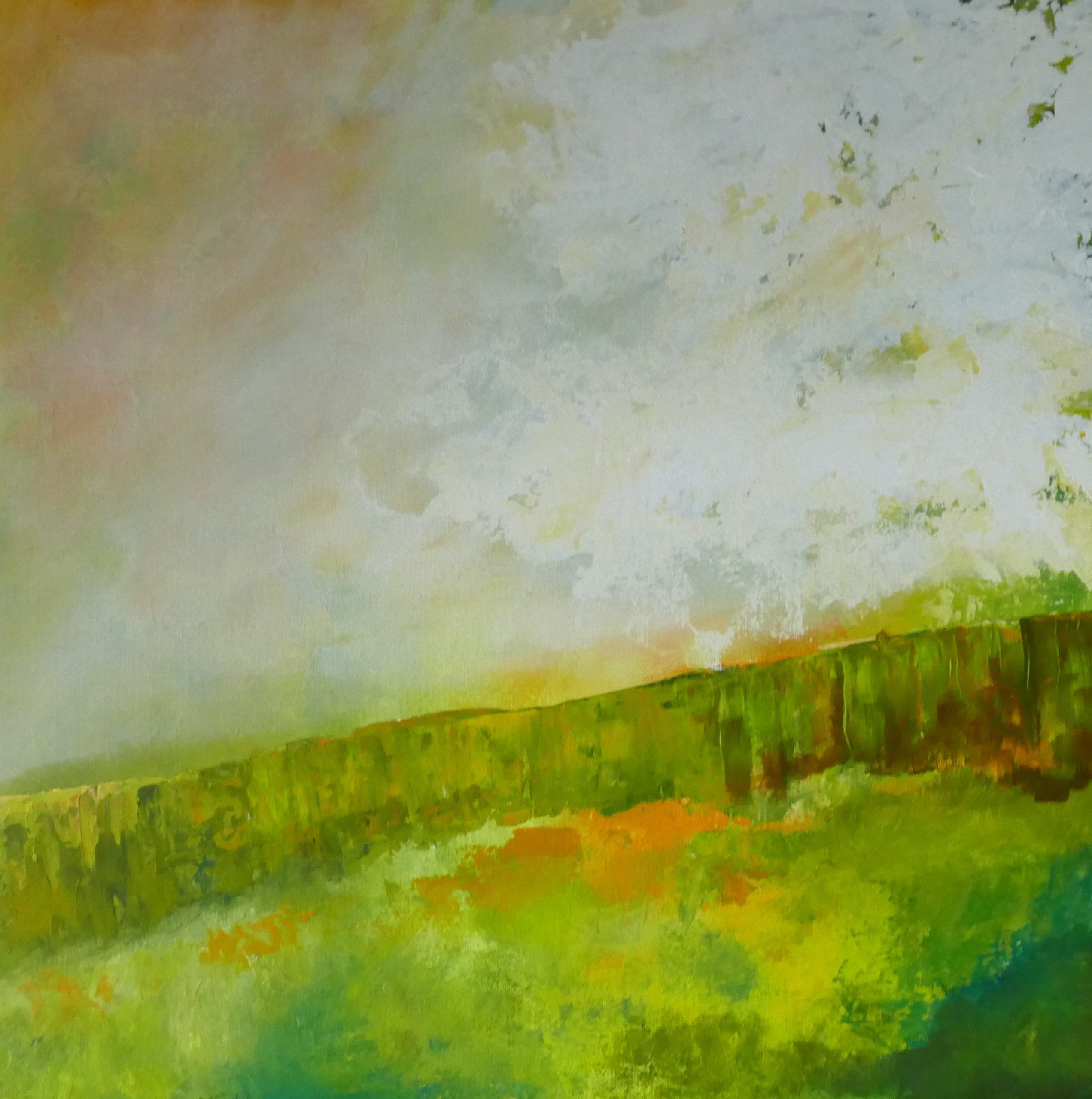
Oranges, reds, golds and deep pinks bring energy and warmth. They:
- Make cooler rooms feel more inviting
- Work beautifully with wood, terracotta and earthy neutrals
- Add drama to dining rooms and living areas
Many of my moorland and statement pieces use these tones to create that “fire in the sky” feeling.
Cool, calming palettes
Blues, teals and soft greens are naturally associated with sea and sky. They:
- Create a sense of calm and openness
- Pair well with grey, white and pale woods
- Work brilliantly in bedrooms, bathrooms and quiet corners
The Ocean and Coastal works often sit in this family – they can make a room feel as if it’s breathing more slowly.
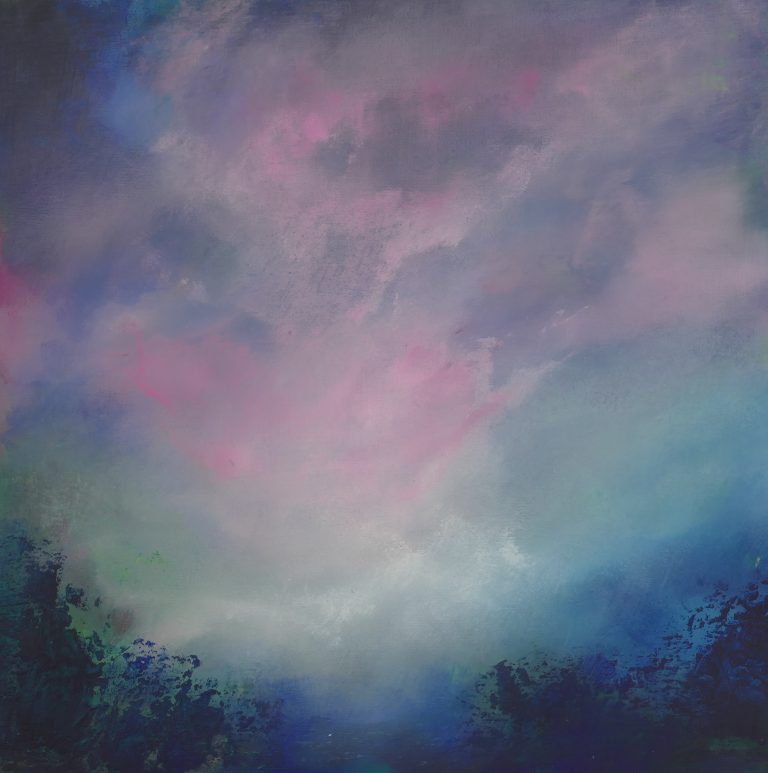
Soft, muted palettes
Mists of grey, blush, lavender and soft neutrals bring a gentle, reflective quality.
- Ideal for spaces where you want art but don’t want it to dominate
- Great with minimalist interiors and Scandinavian palettes
- Lovely in reading nooks or above a workspace
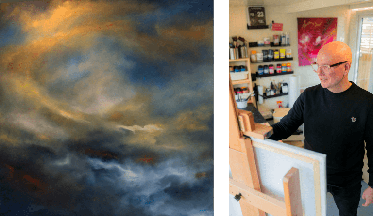
Bold contrasts
Sometimes what a room needs is a bit of tension. A painting that combines deep darks with flashes of light can give a space real character.
- Works well in larger rooms and open-plan areas
- Can anchor more eclectic interiors
- Creates a focal point that draws you in
How to choose for your space
Stand in the room and notice:
- Which colours are already there (walls, furniture, textiles)
- How much natural light you get
- How you want to feel in that room
Then ask: do I want the painting to echo what’s here, or to shift it?
Both are valid. A calm bedroom can be made even more restful with soft blues; a cool, grey living room can be warmed up dramatically by a painting that glows.