By Andy Taylor | Art Haus
Brightwater: The Painting That Changed Its Mind Twice
Some paintings arrive quietly. Brightwater fought me for weeks.
I want to show you something I don’t usually show people. Not the finished piece straight off. The whole journey. Because Brightwater didn’t evolve in a straight line. It went somewhere, then somewhere completely different, then finally found itself.
Where it started
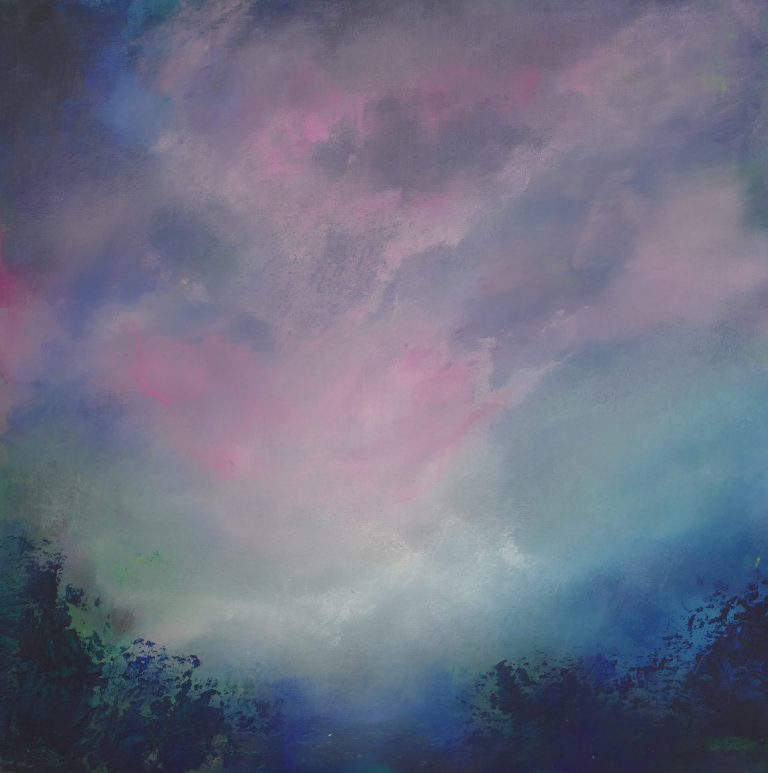
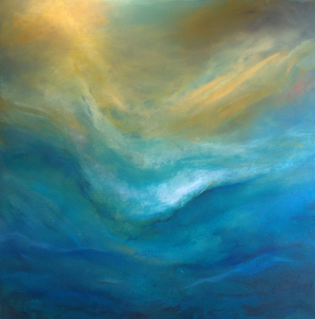
The first version was soft. Golden light, hazy teal, almost dreamlike. Warm olive and amber streaks bleeding into turquoise. It had atmosphere. I liked it for a while and then I thought it just appeared too safe. Too ‘nice’! The kind of painting that would sit nicely on a wall and bother no one.
That was the problem.
The first ‘nice’ landing place
Losing the gold
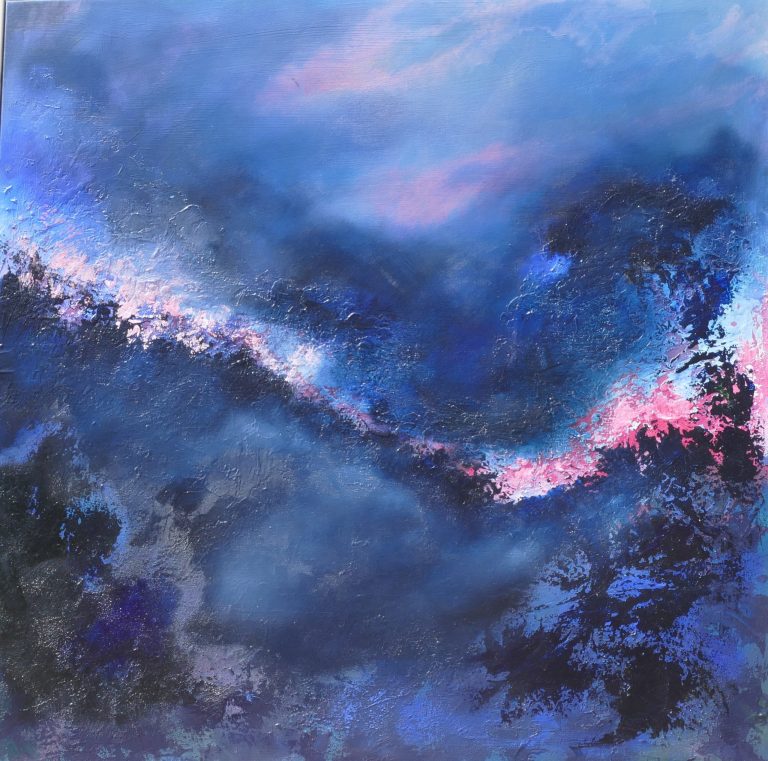
So I went back in. And the painting went somewhere I didn’t expect. The gold nearly vanished. It became almost entirely blue. Deep, moody, private. Beautiful in its own way, but quiet in a way that felt like retreat rather than resolution.
I sat with that blue version for a long time. Something was missing, and I couldn’t immediately say what.
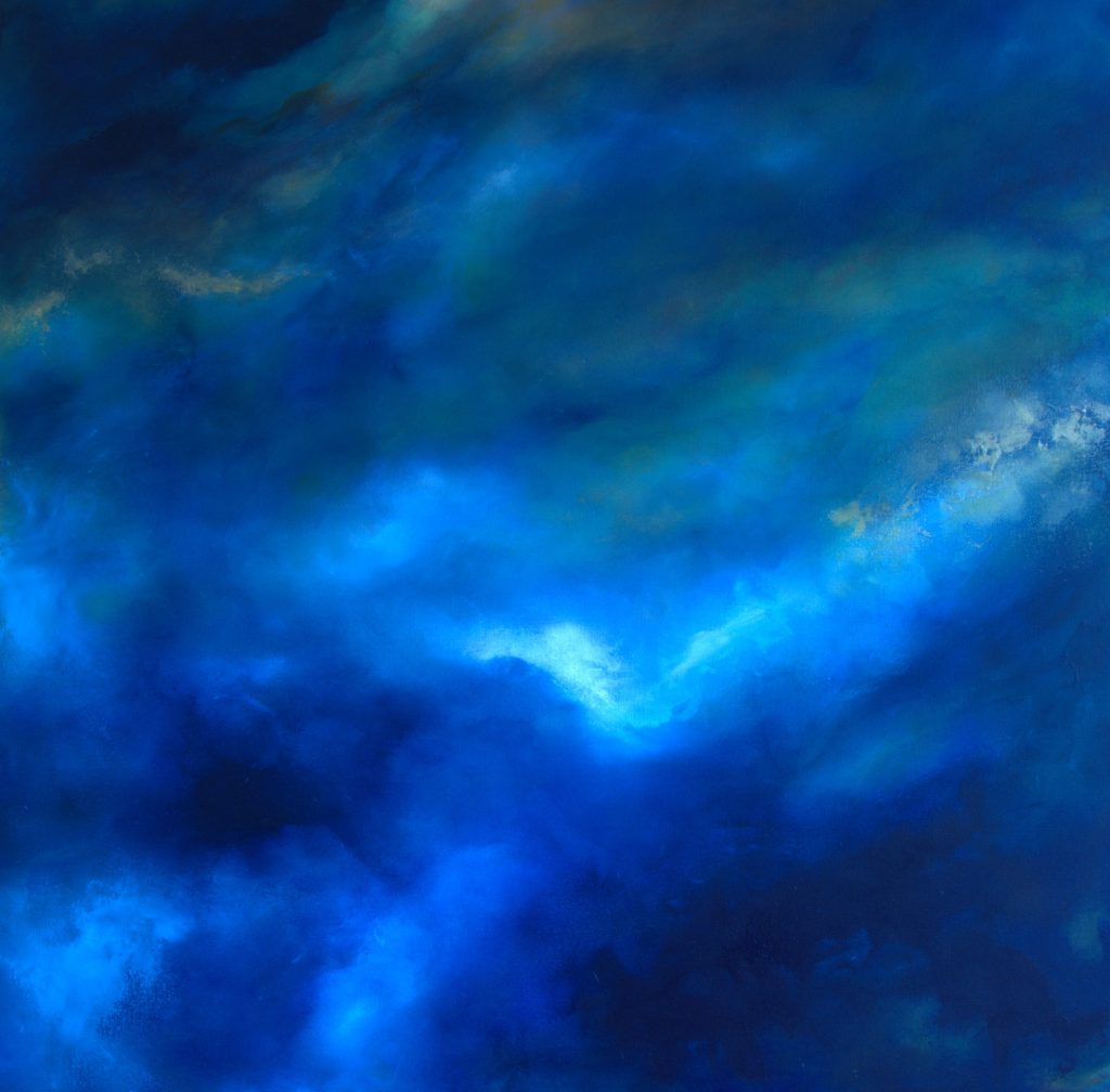
I use a greyscale test on my phone at this stage of any painting; strip the colour out and look only at the values, the light and dark. Under greyscale, that all-blue version was flat. There was nowhere for the eye to travel. Strong colour had been hiding a weak structure.
Finding it again
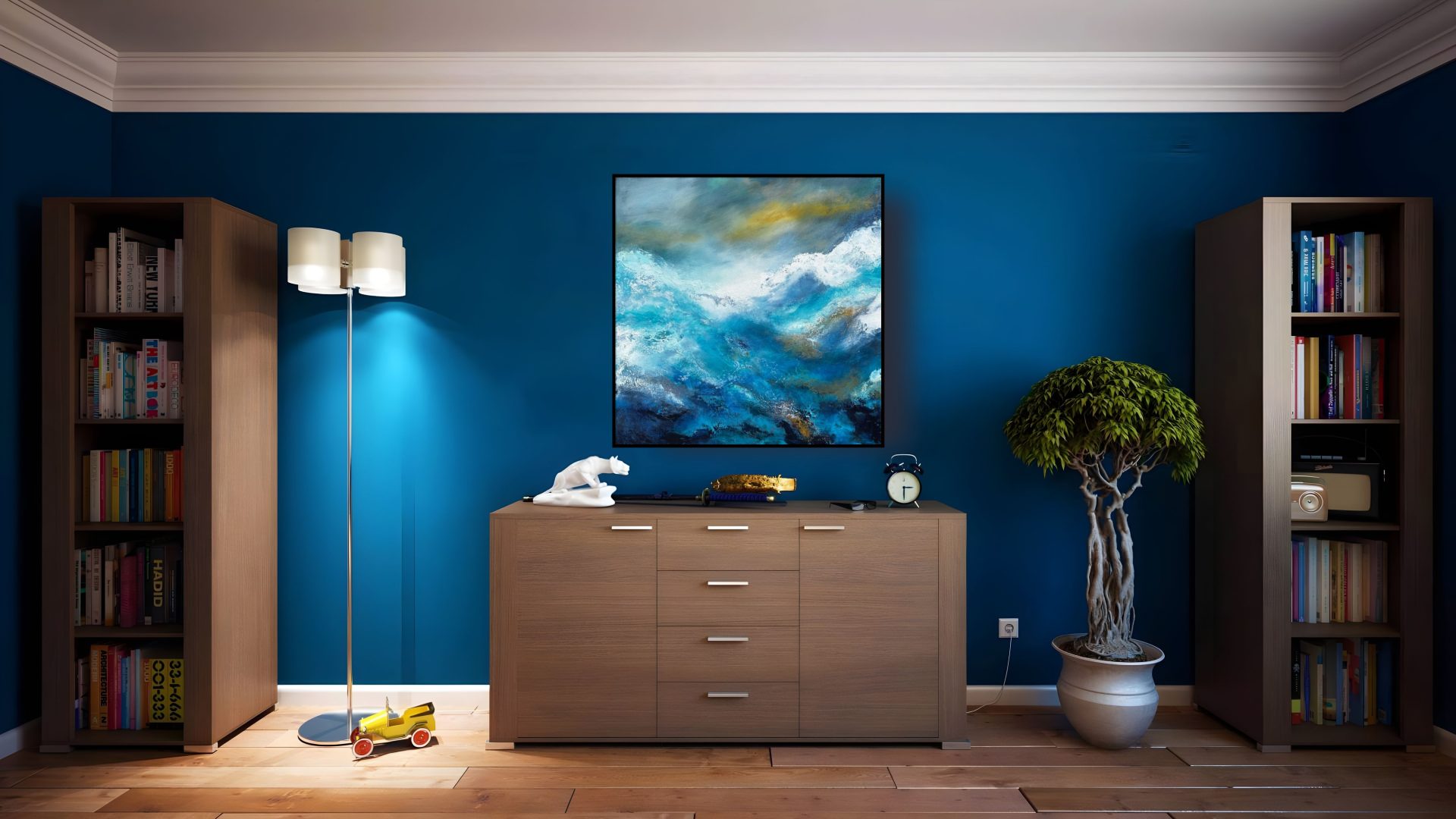
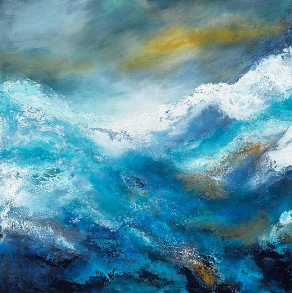
The painting needed less colour discipline and more nerve. So I brought the drama back in, properly this time. Real turbulence. White water breaking across the surface, texture built up with the palette knife so the crests actually catch the light. The gold returned, but only as a memory of where the painting had been, not the whole story anymore.
That’s the version that’s finished. Somewhere between storm and calm, but with a feeling of hope and a positive vibe.
Why I’m showing you this
People often assume a painting like this arrives in one continuous push from blank canvas to finished piece. It doesn’t. Brightwater went through a version that was pretty, a version that was subdued almost to the point of disappearing, and then finally a version with enough conviction to stand up on its own.
The middle version taught me the most. It’s tempting to call quiet and pretty “resolved” just because it’s calm. Sometimes calm is just an excuse not to keep pushing further. The real resolution came from going back in and trusting the chaos again, then finding the quiet on the other side of it, not before it.
That’s the whole practice, really. Chaos, then calm, with a touch of frustration along the way.
Brightwater is available as an original painting. Get in touch if you’d like to see it in person, or browse available originals.